


Inspired by the natural nourishing properties of centuries old glacier water and sand, this natural beauty brand is an homage to the land of ice and fire.
SERVICES
Conceptual
Business Naming
& Identity Design

The name Ljøma is a nod to the word “glow” in Icelandic (ljóma), and references the effects people see when they use the arctic ingredient based products.

Studio Studio provided this client with
Conceptual Business Naming & Identity Design
Ljøma (YO-mah) is a skincare brand focused on utilizing arctic ingredients from Iceland to create naturally glow-giving beauty products for face and body. The typography in the main identity word marks mirrors the Icelandic landscape: sharp and resilient, with soft swooping touches.
The color palette for Ljøma takes elements from the land of ice and fire, and pairs them together for a satisfying blend of cool and warm tones. All of the product packaging is very tactile, either from deeply pebbled textured paper, or soft almost rubbery tubes, which is again a nod to the vibrant visually textured landscape of Iceland.
Brand typefaces are Pangram Pangram Cirka,Trade Gothic, and Marion Script | Brand photography is courtesy of Unsplash.

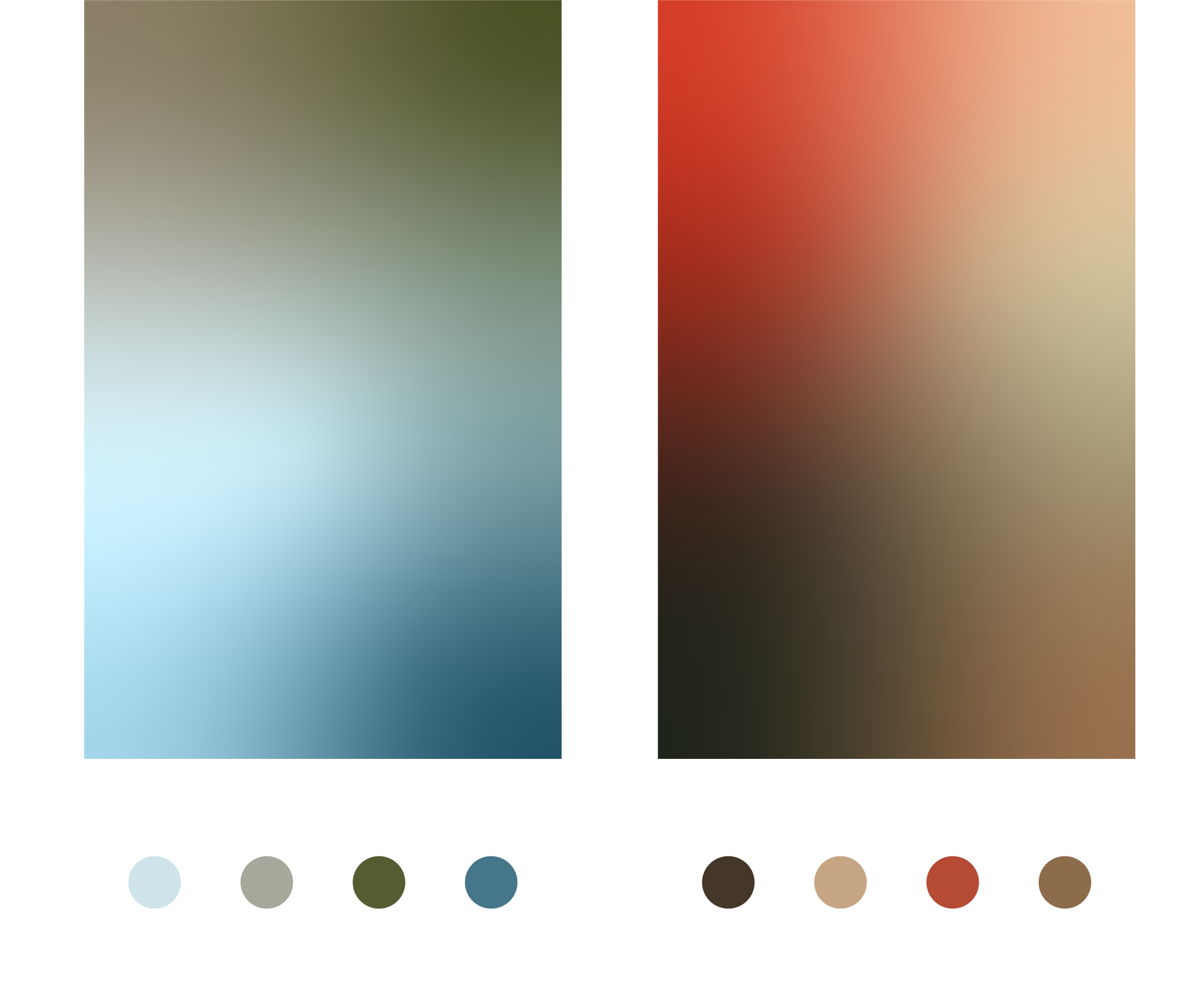
Inspired by the rich and sometimes alien-like landscape of Iceland, the color palette for Ljøma represents two color families that meld together: one of ice and one of fire.
In the left grouping above are colors inspired by the thermal waters of the Blue Lagoon, the ancient deep lagoon blue of ice from Jökulsárlón, and the mossy lichen that grows in the caverns of cool lava rock. The right grouping burns bright like a fresh volcanic explosion, has the deep brown tones from sculptural lava rocks piled on the expansive fjords, and the dusky beige of the summer night sky which never fully darkens.
All colors have a calming yet invigorating depth—just like the skincare advantages given by Ljøma products.
Born from national treasures.
The brand icon developed for Ljøma was derived from the cross sections of lines in the Icelandic flag, paired with the line quality of drawing shapes in the black basalt sands on the shores of Vík in south-western Iceland. The lines are contained in the circular shape from the O in Ljøma, making this icon a well balanced member to the rest of the logo family.


