In a time when it seems everyone has everything, the mission for Willinglee is to bring the joy back to gift-giving.
SERVICES
Business Naming
& Identity Design
The name “Willinglee” is derived from the concept of giving with willful intent and good will towards others. This cornerstone of giving, connection, and generosity is the backbone of Willinglee’s name, visual identity, and its company values.
Studio Studio provided this client with
Business Naming & Identity Design
Abby and Alex Milan started their gift box business in 2020 after they had their own troubles finding the perfect ‘thank you’ gifts for their wedding guests. The business they started was named Little Boxes, and a year after the business launched, they realized that while the core mission of their business was strong (to provide thoughtful gifts for both big-day and every-day gifting, while giving 1% of their sales back to the community), the name and branding had already run their course. Abby & Alex worked with Studio Studio to craft a name that allowed for growth for their company, was more unique to them, and avoided customer confusion—thus Willinglee was born. The name Willinglee is derived from the concept of giving with willful intent and good will towards others. This cornerstone of giving, connection, and generosity is the backbone of Willinglee’s name, visual identity, and its company values. And of course, you can’t spell Willinglee, without a bit of glee.
The brand identity as a whole is a visualization of the key attributes identified at the beginning of the branding process: it is intentional, approachable, and rooted in the human connection. The branding is geared toward a gender neutral audience, and feels celebratory yet appropriate for the everyday gifter. Willinglee nurtures the connections between their customers and the artisans who craft the goods they sell, the gift giver and recipient, and between Willinglee’s business and the community they give back to. The visualization of connection in the identity was imperative, and the name was chosen to lend itself to smooth letterform movements and a visualization of hand-holding between the letters.
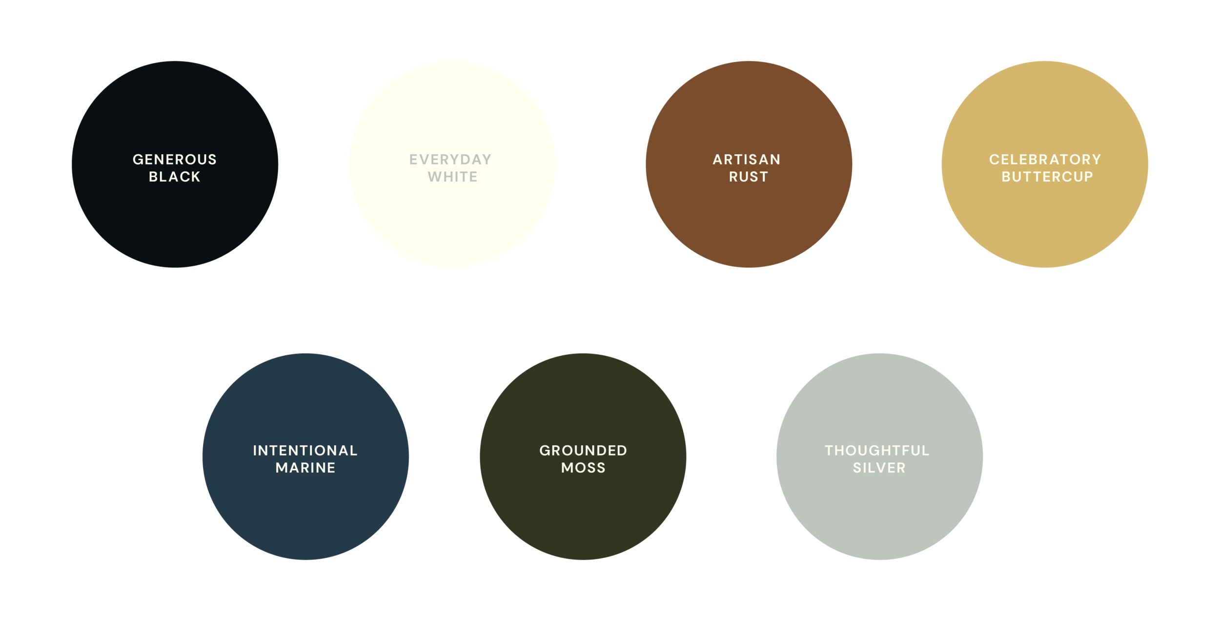
Inspired by elevated tones found in nature, the palette has variety through hue, yet a clearly defined balance of tones.
It does not rely on stark black or white. It achieves an approachable connotation as a whole while containing contrast between each shade. The colors are named after some of Willinglee’s brand definers.
“Final assets you'll be itching to share with your customers.”
kind words
from this client
“Claire is the perfect blend of professional and friendly. Especially for branding, this is an important social balance to master. Coming from a creative director role where I had the opportunity to work with a brand strategist and two branding agencies of different sizes, this experience with Claire was a breath of fresh air. Agency shmagency; Claire knows her stuff! She does her research, delving into your social accounts, pouring over your website, and interviewing you on all aspects of your current brand.
She makes you feel heard and brings to light some critical things to think about, especially for new companies. Her design presentations are thorough and she is quick-to-respond to any questions you have on the directions she presents. Of course, she also takes feedback and constructive criticism well, working to deliver final assets you'll be itching to share with your customers. We're looking forward to expanding our branding package with Claire in the future! Run, don't walk.”


